
ALMANAK CREATIVE
The Project:
A complete brand design for our very own agency! We wanted a brand aesthetic that blends the cleanliness of the International Typographic Style, the rawness of Brutalist design, and the playfulness of folk art.
The Timeline:
November 2024-January 2025
The Outcome:
A complete suite of brand assets and complementary website, including a logo, wordmark, secondary wordmark, brand colors, brand fonts, and verbal identity guide.
Click here to view the full brand guidelines.
Logo Design
Almanak’s logo is the visual representation of our ideals. It is orderly in its shape and structure, fitting to a neat square grid, while being whimsical and artistic in its design.
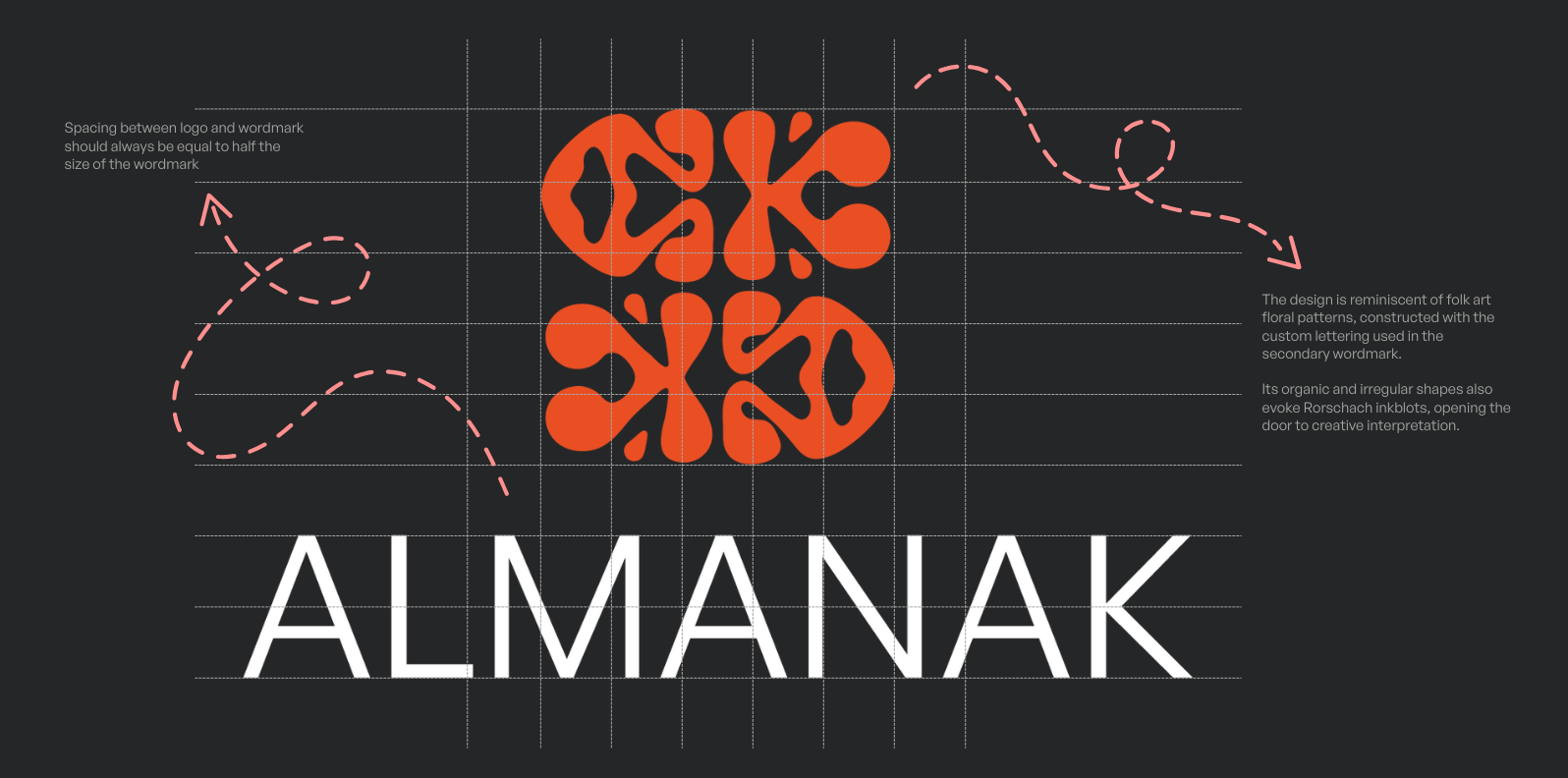
The logo is perfectly imperfect; its hand-drawn characteristic doesn’t take itself too seriously. The design is reminiscent of folk art floral patterns, constructed with the custom lettering used in the secondary wordmark. Its organic and irregular shapes also evoke Rorschach inkblots, opening the door to creative interpretation.


Web Design
You’re looking at it! Built using the Squarespace 7.1 framework, the site is filled with custom code and personal touches to keep it from feeling like a standard template.
Fonts
Almanak’s fonts are clean and classic to contrast the otherwise whimsical logo.
General Sans is the primary typeface for Almanak. Its design is orderly and geometric with round shapes and small apertures.
Gambetta is the secondary typeface for Almanak. Gambetta is a serif typeface especially effective in text and editorial design. It’s legibility, especially in print, compliments General Sans, which can be difficult to read in large blocks of small text.

Colors
Almanak’s color palette has soft neutrals and bold colors.
The primary palette should be used in most situations, with the expanded palette providing additional shades and colors to pull from.

Applications
We developed a collection of mockups to visualize the brand in action—from letterheads to merchandise, it’s important to understand how a brand will look when it is out in the world.


